top of page


Illustration
As a creative professional, I've faced the challenge of adhering to a single style throughout my career. However, I've come to see adaptability as a valuable strength. While some may view not specializing in one style as a disadvantage, I believe it allows me to offer diverse and personalized solutions. Each project and client has unique needs, and my aim is to provide the best approach that meets those specific requirements. This perspective has driven me to explore and embrace various illustration styles, enabling me to continuously evolve and deliver tailored solutions to different design challenges.
Below is a glimpse of some of the commissioned work I've created, allowing for an exploration of styles in the field of illustration—thanks, in part, to the amazing clients who have made this possible.
01
Spiga Graphic Language
For over 20 years, Spiga has been a cherished Italian restaurant in Durban, South Africa, and a favorite among locals. As a long-time client, I’ve collaborated with Spiga to craft a distinctive illustrative style that defines their brand. From uniforms and posters to murals, this visual language has become a vital part of their identity, enhancing the customer experience. Below are some of my designs, showcasing how this evolving style seamlessly integrates with the Spiga atmosphere.

15 Years Anniversary Emblem

Unite Through Football campaign

FiFA world cup instore campaign


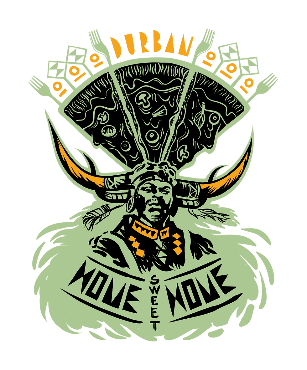
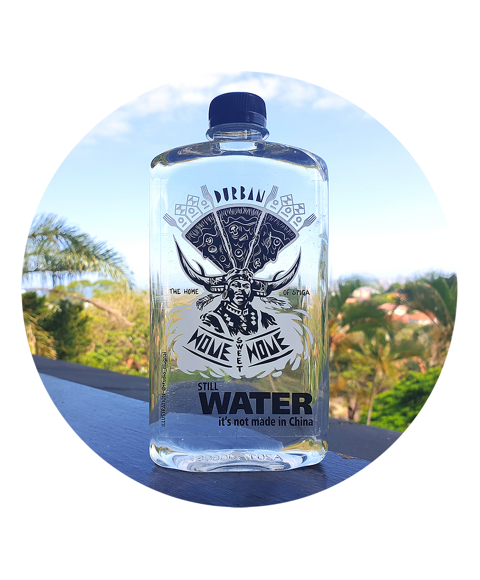
Spiga + It's Not Made in China Collaboration
"It's Not Made in China" is a company bottling water featuring artwork by local South African artists. These unique bottles, made from recycled PET plastic, celebrate creativity while sending a strong environmental message. The collaboration between Spiga and "It's Not Made in China" embodies the three pillars of Spiga's brand ethos: a love for creative art and design, the environment, and their deep connection to their hometown, Durban. The artwork I created celebrates two Durban icons: the Rickshaw and Spiga. It depicts an iconic rickshaw adorned with pizza slices on its unmistakable handcrafted headpiece, symbolizing the fusion of Zulu and Italian cultures—diverse traditions that define the Spiga brand.

02
WorkingClass
WorkingClass was a Durban-based initiative started by Tyrone Bradley and Skullboy in late 2010. After successfully launching their first venture—a skateboarding-themed exhibition of photography, prints, and custom decks titled Our Lives of Deckadence —
I joined the team to offer additional support. Sharing the same vision of promoting Durban's creatives, and as the co-owner of the Upstairs Bar on bustling Florida Road, I was able to provide our initiative with a new resident home for hosting monthly exhibitions.


Photos by Tyrone Bradley

'We own this city' Screen print/Limited edition of 30 - Durban Artist
'Locals Only' exhibition
Locals Only" marked Working Class’s first major exhibition in collaboration with Volcom South Africa, hosted at the Upstairs Bar. The exhibition offers a window into South Africa’s dynamic culture, showcasing works by six creatives from Johannesburg, Cape Town, and Durban. Each artist shares a unique perspective on their city, creating a collective visual story of South African life through the eyes of its locals.
03
Coffee Table print - Colombo Coffee Co.
I was invited by Colombo Coffee Co., a coffee company with a rich history dating back to 1917 in Durban, South Africa, as one of seven artists to illustrate a step in the coffee production process. Each artwork would be transferred onto the tops of seven round coffee tables and showcased at the brewery. My piece focused on the demanding process of coffee harvesting. The artwork was designed to emphasize the contrast between the labor-intensive nature of the harvest and the fast-paced coffee consumption in cafes. By presenting the process from two opposite perspectives, visible from either side of the table, the piece encourages a deeper appreciation for coffee’s journey from farm to cup.

"Click me"
for a different point of view
04
Volcom artist Series Collaboration
An exhibition piece I created caught the attention of VOLCOM, who commissioned me to design an artwork print for their Artist Series T-shirts.


'Beleive' Volocom artist series t-shirt print
02
Colombo Coffee Co.
I was one of seven artists chosen by Colombo Coffee Co. in Durban, South Africa. My task was to illustrate the intricate coffee harvesting process on a custom tabletop. The artwork showcased the stark difference between laborious harvesting and quick cafe consumption. By depicting both perspectives on opposite sides of the table, it aimed to foster a deeper appreciation for coffee's journey from farm to cup.
03
It's Not Made in China
"It's not made in China" is a company bottling water with artwork by local South African artists. These unique bottles, made from recycled PET plastic, celebrate Zulu culture with an Italian influence for Spiga, a renowned Durban Italian restaurant. The artwork combines rickshaws and pizza slices, symbolizing the fusion of diverse traditions that define the Spiga brand.

Click me!
05
Berea Children's Home
A contribution to an exhibition for a charitable cause, raising funds for the Berea Children's Home in Durban, South Africa. Our task was to create artwork for a calendar. Inspired by the challenges of feeding my own children, I came up with a humorous concept for a baby chair. My artwork aimed to capture the joy and chaos of parenthood and promote support for organizations like the Berea Children's Home

Mood sketches & Rough work

'EEZY - FEED 9000' Vector digital artwork/ limited edition prints
Volcom artist Series
I was honored to be commissioned by Volcom South Africa to create an illustration for their artist series T-shirts and contribute to VOLCOM's creative legacy. Additionally, they generously sponsored our collective, WORKINGCLASS, for our "LOCALS ONLY" exhibition, helping to ensure its success and enabling us to connect with diverse communities to share our art.
Berea Children's Home
I joined a local artist exhibition in Durban, South Africa, raising funds for the Berea Children's Home. My artwork for the calendar featured a humorous take on a baby chair, inspired by the chaos of parenthood.

Red Bull - SA
"It's not made in China" is a company bottling water with artwork by local South African artists. These unique bottles, made from recycled PET plastic, celebrate Zulu culture with an Italian influence for Spiga, a renowned Durban Italian restaurant. The artwork combines rickshaws and pizza slices, symbolizing the fusion of diverse traditions that define the Spiga brand.

"It's not made in China" is a company bottling water with artwork by local South African artists. These unique bottles, made from recycled PET plastic, celebrate Zulu culture with an Italian influence for Spiga, a renowned Durban Italian restaurant. The artwork combines rickshaws and pizza slices, symbolizing the fusion of diverse traditions that define the Spiga brand.
Circular plastic economy

06
Verigreen - Circular Plastic Economy
Verigreen (PTY) Ltd, a leading South African plastic company, has been a valued client for years. They are committed to sustainability and the well-being of our planet. Through their foundation, "Invest in Dignity," Verigreen supports women affected by homelessness, involving them in waste collection for recycling. Working with Verigreen's founders, Thina and Michael Maziya, has been a pleasure as I create sustainable messaging illustrations that showcase their values and vision for a better world.


Mood sketches & Concept drawings
Verigreen 'Circular Economy' Vector digital artwork for interior application

07
We Design - UKZN
The "We Design" conference in Durban, led by architect Andrew Makin, delved into urban regeneration. Experts explored how urbanization affects revitalization and gentrification of formerly marginalized areas. I created a key visual for all communication materials.
Mood sketches & Rough work


08
Red Bull Sugar free
Red Bull South Africa ran a fun social media campaign for the launch of Red Bull Sugarfree. The brief was to communicate that Red Bull's alternative sugar-free option strongly embraced the brand’s core essence of pushing limits — both physically and mentally — while highlighting that zero sugar didn’t mean zero energy.

Instagram post
bottom of page